Weekly Report 12Nov2010
From RHESSI Wiki
| Line 31: | Line 31: | ||
The following images and plots of the flux are for the simulated source near the disc center. | The following images and plots of the flux are for the simulated source near the disc center. | ||
| - | The following image is for the source near disc center with the lowest number of total counts, approximately 10^4 | + | The following image is for the source near disc center with the lowest number of total counts, approximately 10^4. |
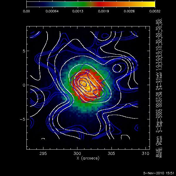
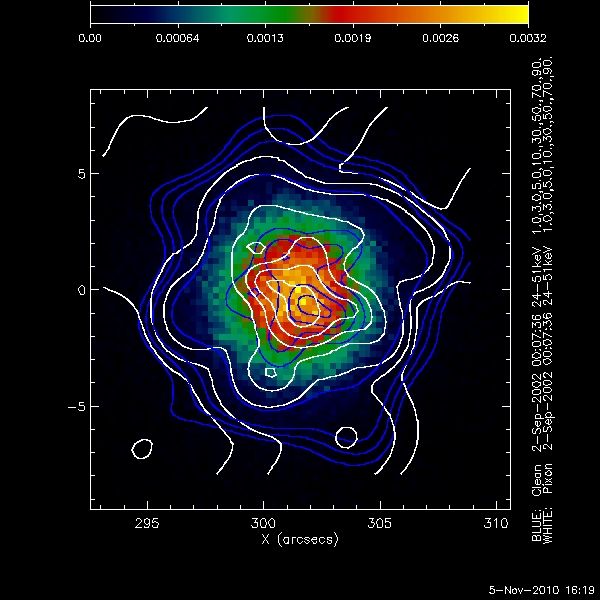
[[Image:Clean pixon lowest counts.jpg|center|thumb|600px|The above shows the original data map(background image), the clean contours (Blue), and the pixon contours (White), for ~10^4 total counts in the image.]] | [[Image:Clean pixon lowest counts.jpg|center|thumb|600px|The above shows the original data map(background image), the clean contours (Blue), and the pixon contours (White), for ~10^4 total counts in the image.]] | ||
Both imaging techniques produce an elliptical source around the centroid of the original data map. The Pixon image breaks up into multiple smaller sources at the centroid. Neither method reproduces a symmetrical albedo contribution away from the centroid of the image. This may be due to the low number of counts away from the compact source. | Both imaging techniques produce an elliptical source around the centroid of the original data map. The Pixon image breaks up into multiple smaller sources at the centroid. Neither method reproduces a symmetrical albedo contribution away from the centroid of the image. This may be due to the low number of counts away from the compact source. | ||
| - | + | The following plot showa the flux as a function of radial distance from the centroid of the source from an image with total counts of approximately 10^4. | |
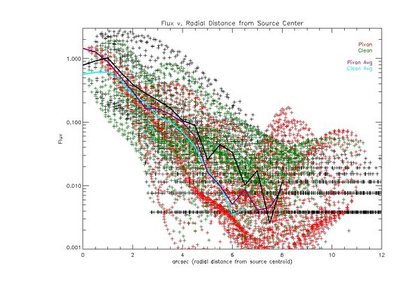
| - | [[Image:Flux 301 low avg.jpg |center|thumb|600px|]] | + | [[Image:Flux 301 low avg.jpg |center|thumb|600px|The flux as a function of radial distance from the source centroid. The original map is shown in black dots. The black line represents the average of the flux at a given radial distance. The pixon image is shown in red dots. The purple line represents the average of the flux at a given radial distance. The clean image is shown in green dots. The cyan line represents the average flux at a given radial distance. The total counts in the image is ~10^4.]] |
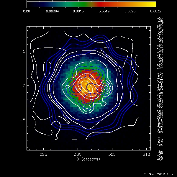
[[Image:Clean pixon middle counts.jpg|center|thumb|600px|The above shows the original data map(background image), the clean contours (Blue), and the pixon contours (White), for ~10^5 total counts in the image.]] | [[Image:Clean pixon middle counts.jpg|center|thumb|600px|The above shows the original data map(background image), the clean contours (Blue), and the pixon contours (White), for ~10^5 total counts in the image.]] | ||
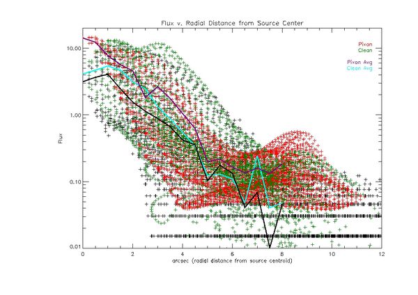
| - | [[Image:Flux 301 mid avg.jpg|center|thumb|600px|]] | + | [[Image:Flux 301 mid avg.jpg|center|thumb|600px|The flux as a function of radial distance from the source centroid. The original map is shown in black dots. The black line represents the average of the flux at a given radial distance. The pixon image is shown in red dots. The purple line represents the average of the flux at a given radial distance. The clean image is shown in green dots. The cyan line represents the average flux at a given radial distance. The total counts in the image is ~10^5.]] |
[[Image:Clean pixon high counts.jpg|center|thumb|600px|The above shows the original data map(background image), the clean contours (Blue), and the pixon contours (White), for ~10^6 total counts in the image.]] | [[Image:Clean pixon high counts.jpg|center|thumb|600px|The above shows the original data map(background image), the clean contours (Blue), and the pixon contours (White), for ~10^6 total counts in the image.]] | ||
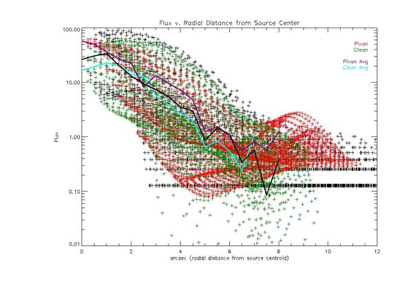
| - | [[Image:Flux 301 high avg.jpg|center|thumb|600px|]] | + | [[Image:Flux 301 high avg.jpg|center|thumb|600px|The flux as a function of radial distance from the source centroid. The original map is shown in black dots. The black line represents the average of the flux at a given radial distance. The pixon image is shown in red dots. The purple line represents the average of the flux at a given radial distance. The clean image is shown in green dots. The cyan line represents the average flux at a given radial distance. The total counts in the image is ~10^6.]] |
| Line 51: | Line 51: | ||
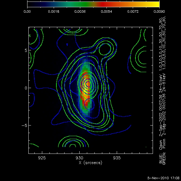
[[Image:Clean pixon low.jpg|center|thumb|600px|The above shows the original data map(background image), the clean contours (Blue), and the pixon contours (White), for ~10^4 total counts in the image.]] | [[Image:Clean pixon low.jpg|center|thumb|600px|The above shows the original data map(background image), the clean contours (Blue), and the pixon contours (White), for ~10^4 total counts in the image.]] | ||
| - | [[Image:Flux 930 low avg.jpg|center|thumb|600px|]] | + | [[Image:Flux 930 low avg.jpg|center|thumb|600px|The flux as a function of radial distance from the source centroid. The original map is shown in black dots. The black line represents the average of the flux at a given radial distance. The pixon image is shown in red dots. The purple line represents the average of the flux at a given radial distance. The clean image is shown in green dots. The cyan line represents the average flux at a given radial distance. The total counts in the image is ~10^4.]] |
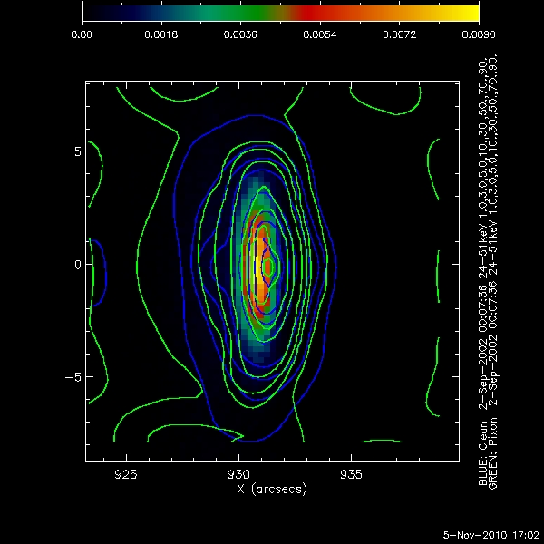
[[Image:Clean pixon middle.jpg |center|thumb|600px|The above shows the original data map(background image), the clean contours (Blue), and the pixon contours (White), for ~10^5total counts in the image.]] | [[Image:Clean pixon middle.jpg |center|thumb|600px|The above shows the original data map(background image), the clean contours (Blue), and the pixon contours (White), for ~10^5total counts in the image.]] | ||
| - | [[Image:Flux 930 mid avg.jpg|center|thumb|600px|]] | + | [[Image:Flux 930 mid avg.jpg|center|thumb|600px|The flux as a function of radial distance from the source centroid. The original map is shown in black dots. The black line represents the average of the flux at a given radial distance. The pixon image is shown in red dots. The purple line represents the average of the flux at a given radial distance. The clean image is shown in green dots. The cyan line represents the average flux at a given radial distance. The total counts in the image is ~10^5.]] |
[[Image:Clean pixon high.jpg |center|thumb|600px|The above shows the original data map(background image), the clean contours (Blue), and the pixon contours (White), for ~10^6 total counts in the image.]] | [[Image:Clean pixon high.jpg |center|thumb|600px|The above shows the original data map(background image), the clean contours (Blue), and the pixon contours (White), for ~10^6 total counts in the image.]] | ||
| - | [[Image:Flux 930 high avg.jpg |center|thumb|600px|]] | + | [[Image:Flux 930 high avg.jpg |center|thumb|600px|The flux as a function of radial distance from the source centroid. The original map is shown in black dots. The black line represents the average of the flux at a given radial distance. The pixon image is shown in red dots. The purple line represents the average of the flux at a given radial distance. The clean image is shown in green dots. The cyan line represents the average flux at a given radial distance. The total counts in the image is ~10^6.]] |
Revision as of 01:36, 16 November 2010
Contents |
Pixon Albedo Imaging Results
Using Eduard Kontar's simulated eventlist files, Pixon Images were created for a compact circular gaussian source with an albedo near disk center, and near the limb. The following parameters were used for each image:
- Time: 2-Sep-2002 00:07:36 - 00:08:16
- Energy 24keV - 51keV
- Detectors 1 t0 4
- Image Size: 64 by 64 pixels
- Pixel Size: .5 arcsec by .5 arcsec
In each Image below the following convention was used:
- Background Image: The original data map supplied by Eduard Kontar
- Blue Contours: The Clean Image Contours
- White Contours: The Pixon Image Contours
The Contours levels used were: 1%, 3%, 5%, 10%, 30%, 50%, 70%, and 90%.
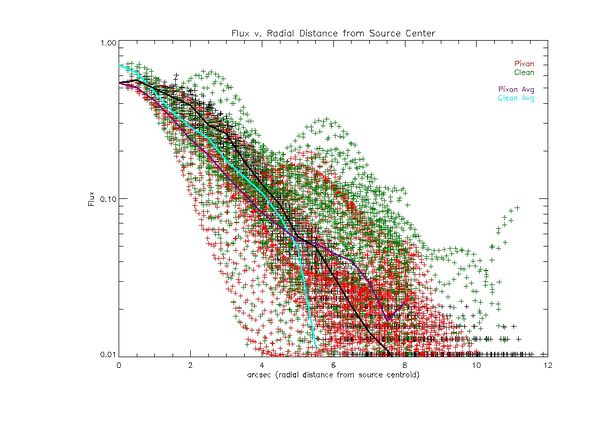
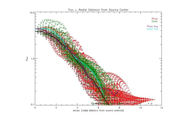
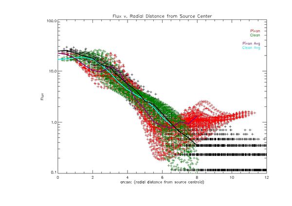
The plots below each image show the flux of a pixel as a function of the distance from the centroid of the source. It is a modification of looking at the flux along a single line through the image. In this method every pixel is plotted so the entire image can be viewed. The following conventions were used in all radial profile plots:
- The values of the flux for the original data map were 'normalized' such that the peak value matches the peak value of the Pixon images
- The flux values for each pixel in the original data map are black points
- The flux values for each pixel in the Pixon image are red points
- The flux values for each pixel in the Clean image are green points
- The average value of the flux at each radial distance in the original data map is represented by the solid black line
- The average value of the flux at each radial distance for the Pixon image is represented by the purple line
- The average value of the flux at each radial distance for the Clean image is represented by the cyan line
Simulated source closer to disc center(X = 301 arcsec, Y= 0 arcsec)
The following images and plots of the flux are for the simulated source near the disc center.
The following image is for the source near disc center with the lowest number of total counts, approximately 10^4.
Both imaging techniques produce an elliptical source around the centroid of the original data map. The Pixon image breaks up into multiple smaller sources at the centroid. Neither method reproduces a symmetrical albedo contribution away from the centroid of the image. This may be due to the low number of counts away from the compact source.
The following plot showa the flux as a function of radial distance from the centroid of the source from an image with total counts of approximately 10^4.
Simulated source near the limb (X = 930 arcsec, Y = 0 arcsec)
